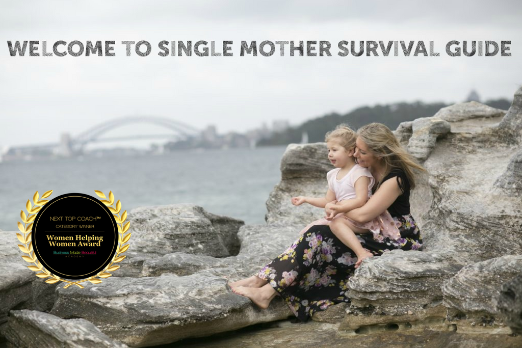


Are You a Single Mum? I Can Help You!
Becoming a single mum is one of the most daunting and overwhelming life changes someone will ever go through. Whether you are pregnant or have teenagers, you will most likely be confused and struggling with what to do next. I became a single mum in 2013 when my daughter was just a few months old and it has been a challenging but rewarding journey ever since. This website was created to assist newly single mothers in all things they may need to know about to get through this tough time.
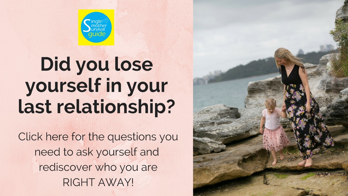
A good place to start is by downloading the "I'm a single mum... now what?" Essential Guide. Here you will find information on Centrelink and Child Support and all the practical advice for the new single mum to get back on her feet.
The Free Resources provide some useful Hints & Tips and Related Links that may be of interest to you, some resources on where to get help, some information on Online Security and also FAQs. There is also a page with Research if you are interested. This includes useful books, articles, research papers conference papers etc. on separation, divorce and impacts on children and so on.
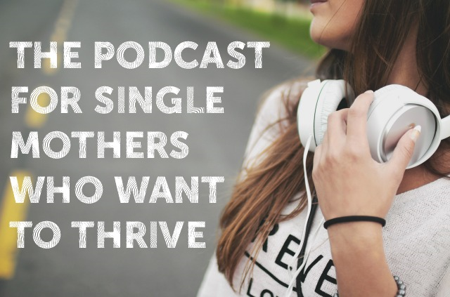
Please take some time to read my blog too and listen to the Single Mother Survival Guide Podcast which you can subscribe to here.
Please keep in mind that I am a Certified Divorce Coach and a Certified Transition and Recovery Roach, and not a lawyer. Please always get your own personalised coaching, legal, and psychological advice.
If you are after some online support, I'd love for you to join the Single Mother Survival Guide Support Forum which is a closed group where you can connect with other single mums in a forum and ask / give advice and support. You can click to join this group here.
If you have any questions please don't hesitate to contact me.
Good luck!
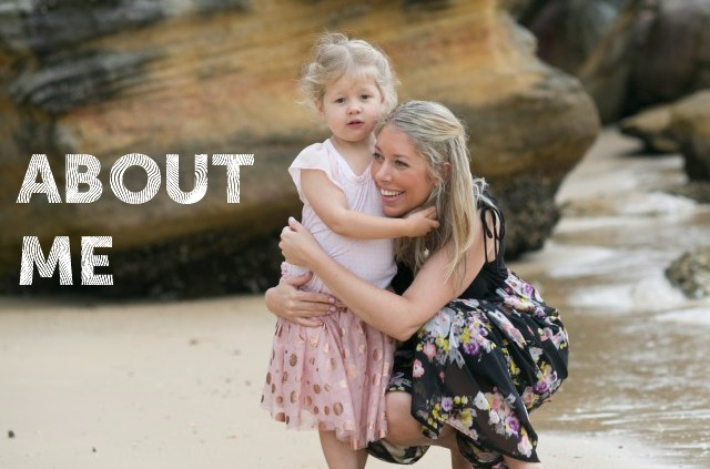
Julia xx
Testimonials
When I first reached out to Julia I was struggling with self-love. After our time together I have higher self-confidence as I now see myself in a more positive light. Julia helped me reach my goals by giving me practical tools to help me plan, prioritise and focus on making time for myself. I became emotionally stronger and I became more focused on my goals. I would definitely recommend reaching out to Julia. She is so approachable and supportive and her program really does help change your mindset. Having the positive encouragement from Julia to be that voice to remind me that I CAN do it was something I benefited from the most. Thank you for everything Julia, the mentoring from you was amazing.
J.D Australia
I came across Julia's website during a particularly low point in my life. I had been a single Mum for 5 years and I was exhausted! I never took time out for myself and I was not enjoying myself at all. With Julia's help, I started to make small, positive changes to my life. It was challenging at times, I had barely thought about my own needs and wants in 5 years! But the changes were immediate. Since I've completed the program, I have maintained the changes I made and this has paved the way for me to make some other exciting decisions that will continue to improve my life. I feel like a different person now. I am more positive, I make time for myself and I'm excited about my life! Thank you Julia! I am so grateful for everything you have done for me and my son xx
E.V Australia
It was Christmas and I was feeling particularly down and depressed. My partner had left our little boy and I six months prior after admitting he was having an affair. It knocked me down and made me question so many things, including myself. It seemed everyone else was out celebrating the festive season with their families which made me feel more alone than ever. I knew of Julia after a friend of mine at work mentioned her podcast and I decided to reach out to her. I am so glad that I did. Julia's commitment and support were evident right from the start – she went out of her way to arrange for us to have our initial complementary clarity call while she was holidaying with her family over Christmas!!! Julia took the time to really understand me and provided expert advice as well as practical exercises and tools. I always felt that we were a team, working together on my personal growth. I have done counseling before but have never come across someone as passionate and supportive as Julia or a program that is so personalised. I will forever be grateful to Julia for helping me grow and form new, positive habits.
G.G Australia
I hope this conveys how grateful I am to have found you and the help and guidance you gave me. You're so beautiful and sincere, there's no bullshit about you which is so refreshing and it allowed me to open up and trust you instantly...
I first started searching for someone like Julia at a time in my life when I wasn't coping terribly well juggling everything and knew I needed some help.
My ex left me when I was 6 months pregnant so I've raised my daughter on my own for the last 4 years. Apart from the usual stresses of being a single mum, I had also been dealing with a number of other stressors and then one horrible week I broke my foot and my boyfriend and I broke up (which was the first relationship I've had since my ex left us) ... and that just brought me undone!
Julia helped me through a very upsetting and emotional time. Being able to talk things through with someone that has had similar life experiences was so comforting. Julia tailored a program to suit my needs and helped me change my mindset and feel more in control and present in life.
Julia is a very special and lovely lady. She is an unbelievably supportive, passionate and genuinely warm and caring person. I felt instantly at ease speaking with Julia and am extremely grateful I found her when I did. Thank you Julia, you're amazing x
M.J Australia
Dear Julia, - I wanted to write all week just to let you know a couple of things, now that it has been a couple of weeks since we finished up.
First of all THANKS AGAIN, - I really enjoyed the 3 months with you, I felt like I was 'held' somehow, in that time, and that all these things which I was addressing privately, then came out in real life and I was able to practice responding and learning, - it was such a beautiful experience, - very profound for me. I DO feel empowered now, very strongly, and very secure suddenly.
When I first reached out to you I was struggling with time management, sleep, and feeling motivated. I felt totally muddled and mentally exhausted about what I was doing with my life and how to get anything done. My diet was terrible, I had no control over my spending, I was unhappy where I lived and had been feeling angry for over a year about a broken friendship. I also didn't exercise enough and was in a bit of a quiet mess.
Breaking down my negative thoughts was such a big part of the process for me, because I learned to recognise how I was feeling and how an alternative, more positive way of dealing with things looked. I soon realised that I was having a few very similar negative thought patterns constantly and that made it much easier to recognise while I was having them. Now I can stop a thought process from getting too dramatic or negative, by recognising it, and seeing it in a much more positive light.
During our time together I also let go of the anger and guilt I felt over the breakdown of my friendship. This was massive for me, and I really did let it go and forgive myself for my part in it. I also started to run on almost every day which I was not at work and made this a 'non-negotiable' event in my week. I scheduled time in to run and then I just did it.
I really enjoyed the goal setting exercise and the vision board, because they really got me thinking, and starting to think, about what I want to do with my life, other than be a mother, and it has been very transformative already. It didn't happen straight away but I am now starting to recognise goals and really long wished for and deep-seated desires start to want to be put into action, and so many of those were in some way on my vision board at the beginning, even in ways I didn't realise at the time. I have it on my bedroom wall and I love it. The goals are also stacking up now!!! I have a lot of planning to do!!
I really can't say that anything lacked or was missing or that you could improve on – other than I wish I could have carried on! I realise that the whole point of this is that you don't get reliant on someone else too much, but I loved having someone to talk things through with. I can't think of anything I would change - I initially specified a couple of areas which I didn’t think I needed to look at and you took those into account brilliantly.
I have loads of friends who have said to me "I wish I was a single mother too then I could call her up, she sounds amazing!!". Working with you has truly been the best money I have ever spent and I feel like it has been a life changing experience for me - I cannot even begin to tell you how different I feel now to how I felt 3 months ago.
THANKYOU! Thank you so much. I know that you kept on saying it was me doing all the work etc etc, - and obviously that is true also, but you have put so much work into this to make it a structured and organised process, all the exercises and articles to read and different templates and things, - you have done immense work on it and then tailored it perfectly to the individual, - plus you bring yourself and your experiences and thoughts to it, so that it feels in the end like talking to a really motivated and inspiring friend giving you a kick up the arse. I loved that so much, and that it wasn't a one-way conversation like one might have with a therapist who never gives you anything of themselves.
I am in complete awe of all that you have achieved over the last 5 years and REALLY want to thank you so much. It has been a really extraordinary 3 months and I feel really sad it’s over.
Anyway, I could just ramble on all night but better go, and just wanted to say THANKS for all once again and that I am sending you all my love and support and thanks and a million hugs for helping me to find myself again. I think you are doing AMAZING work. I do hope that one day we can have a bottle of wine together and laugh our heads off. MUCH love xxxx
M. R Scotland
Thank you Julia. You have really changed my life and my kids’ lives for the better!!! When I reached out to you I was struggling with deciding whether to leave my relationship or not and whether I would cope on my own emotionally, financially and mentally. But working with you I felt confident with my decision to leave and that I had tried everything to fix the relationship. I felt confident I could cope this time because I had you who I could reach out to. And I felt empowered and started to love myself and realize I deserved better and I deserved to be happy!!!
I loved the present and handwritten card! It made my day receiving it in the mail!!! And using it has changed my thinking and my life!!! I would absolutely recommend working with you to anyone I know! I couldn’t have asked for a more honest, supportive, resourceful, caring, friendly mentor!!!! Best money I've ever spent and should have done it ages ago!!!
C.B Australia
Julia has been a rock in the 12-18 months of my very shaky relationship. There have been many times I’ve messaged her to say it’s all over and then 2 days later we are trying again. I’m still sorting out my relationship and whether or not it’s finished, but there’s been no judging on Julia’s side. She’s been there responding to my hysterical rambling messages and even called me to talk through my fears and concerns about being a single mum. I’m not sure where the future will take me, every morning I wonder if it’s time to take the leap and join an amazing tribe and show my sons that women are strong and powerful. But I know that Julia will support me no matter what I do, and will (hopefully) always be there to pick me up, wipe the dirt off and get me back on my way again.
S.W Australia
The Single Mothers Survival Guide is a must for women who need support and guidance. Julia (founder) is a positive and inspirational woman who is dedicated to helping others survive through parenthood. Not only this, but she goes above and beyond to provide answers to questions that any parent would want to know… but may not have the resources to ask. I encourage anyone to follow her podcast and social media, and of course get in touch. She is a friendly, warm and clever woman.
C. O Australia
I'm writing to gush and goss about just how effing fabulous you are and to THANKYOU(!!!!!!!) for saving my sleep and my sanity these past few weeks!! If not for you I would be an even bigger sleep deprived and über depressed zombie... I feel so validated and satiated when I hear you repeating back to me the positive affirmations of my newfound situation... you'll never know how much you've done for me xxxxx.
F.M Australia
You are amazing - and I can't tell you how much I appreciate your support at the moment. You've helped me so much in the last few weeks and I don't think I could've got through it without you.
R.N Australia
Single Mother Survival Guide gives me a practical perk-me-up on days when I need it most. I love the podcast interviews with real personalities most because it goes back to the core of who we all are – mothers who are trying their darnedest to make a life for their kids so that they don’t have to recover from their childhood. Thank you Julia for giving us a voice and sharing your heart.
D. G Australia
Hot Topics
Legal Disclaimer - the content - including publications - on this website is intended only to provide a summary and general overview on matters of interest. It is not intended to be comprehensive nor does it constitute legal advice. We attempt to ensure that the content, but we can not guarantee it's currency. You should seek legal or other professional advice before acting or relying on any of the content.
Single Mother Survival Guide is a participant in the Amazon Services LLC Associates Program, an affiliate advertising program designed to provide a means for sites to earn advertising fees by advertising and linking to amazon.com
The Single Mother Survival Guide Privacy Policy can be viewed here.